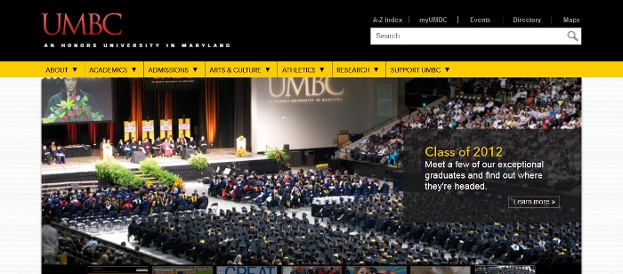
If, in getting to this post, you navigated straight to myUMBC and bypassed UMBC's home page, you probably haven't seen its new look.
The update is part of a long term project to improve UMBC's web presence. "Our marketing and recruitment efforts demand a cutting edge homepage, and the innovation and expertise of our faculty in the computer science, information technology and visual design fields further raise the bar," said a UMBC press release. "In the constantly evolving environment of the web, we simply can’t stand still."
The goal is to make the site more user friendly. To that effect, the update includes tabs targeted toward different members of the UMBC community (current students, prospective students, faculty and staff, etc.) that provide the most relevant information for their audience.
Plus, the new page is designed to work well with mobile devices like smartphones, and tablets.
You can send feedback about the new design to Sorry, you need javascript to view this email address. What do you think makes a website user friendly? Does UMBC's new homepage meet your criteria?
